Why Databricks Notebook Dashboards Stand Out
In the world of data-driven decision-making, dashboards are essential for turning raw numbers into actionable insights.
While most dashboards help you visualize numbers, Databricks takes it a step further by making the process smooth, flexible, and tightly integrated with your working environment.
Databricks notebook dashboards offer a unique blend of power, simplicity, and flexibility that sets them apart.
What Are Notebook Dashboards?
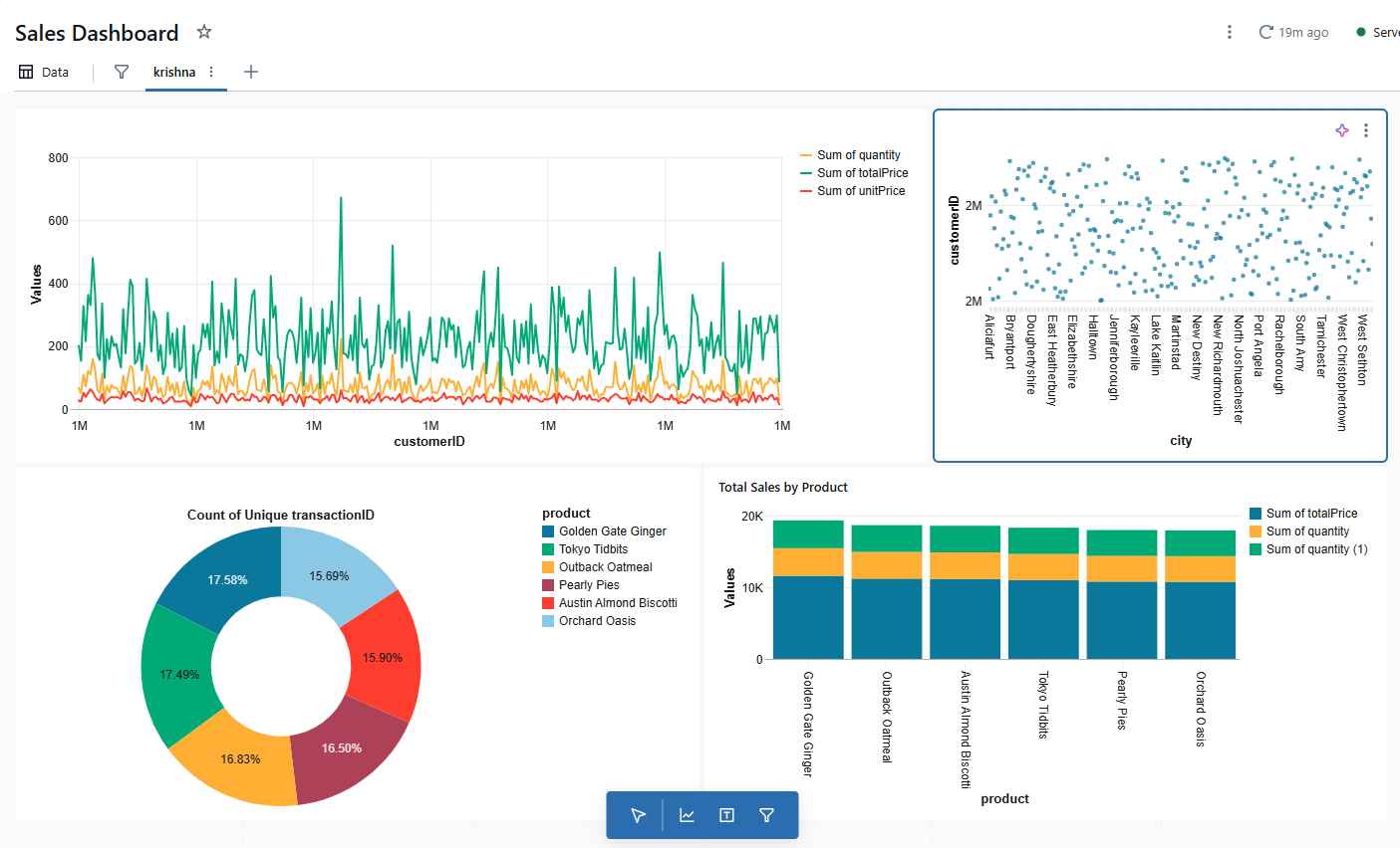
Notebook dashboards are a presentation-friendly format created directly from the output of notebook cells. Unlike external reporting tools, they stay tightly integrated with your Databricks notebooks, ensuring real-time accuracy and seamless updates.
You can:
- Display key visualisations in an intuitive layout.
- Schedule updates via jobs.
- Present insights in full-screen mode.
Integrated Insights, Powered by Your Code
Rather than forcing you to switch between tools or export your findings, Databricks notebook dashboards let you take the output from your analysis tables, visualizations, and summary stats directly from your coding workspace and arrange them into a sleek dashboard.
Whether you use Python, Scala, or SQL, you can pin results and build dashboards as you analyze, all within the same notebook.
Key benefits:
- You never have to leave your notebook or lose track of your workflow.
- Fixing the code and table if any issues are found in the dashboard. In another visualization tool, it takes time to change the code, load it as a table, update the dataset, and see changes in the visual. It’s more complex.
- The process is fully reproducible: rerun the notebook and your dashboard stays in sync.
- Every chart or result is instantly available for sharing or further exploration.
Lightweight & Flexible by Design
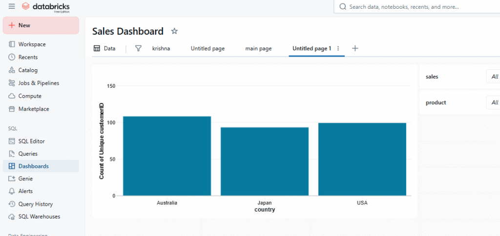
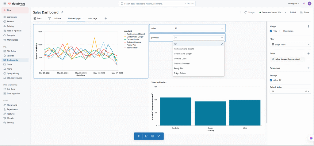
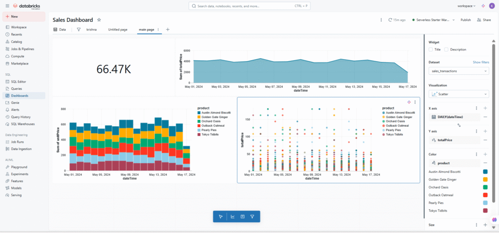
Notebook dashboards are designed to be minimal but powerful. Adding a chart or summary to your dashboard is as simple as a drop-down click. No dragging files between apps, and no clunky setup.
- All components (charts, tables, text) can be renamed, moved, resized, or removed just by dragging and dropping.
- Refreshing your dashboard is effortless: just rerun the notebook or set it to update on a schedule. There’s no additional scheduling system or complex refresh pipeline to maintain.
This simplicity means they’re ideal for:
- Quickly sharing findings with your team
- Demoing your work to stakeholders
- Iterating ideas without overhead
- Internal reviews and updates.
Always Up-to-Date, No Hassle
Because dashboards are linked directly to your notebook outputs, they’re always current. Change your code or data, clear a cell, or re-run your analysis, and the dashboard reflects those updates instantly.
No need for separate data pipelines or manual refreshes — the dashboard stays in step with your latest work.
- Clear the cell → it vanishes from the dashboard
- Update the code/data → schedule a job → dashboard updates automatically (Databricks Documentation, YouTube)
How Do They Compare? Dashboard Types and Traditional Tools
Here’s a quick comparison between Databricks dashboards and traditional BI tools:
Feature | Notebook Dashboards | AI/BI Dashboards | Power BI/Tableau (Traditional BI) |
Supported cell types | Any (SQL, Python, Scala) | Only SQL | N/A |
Setup time | Instant pinning | Build canvas, configure filters | Data model, setup, sync required |
Interactivity | Read-only visuals | User filters, widgets, dynamic controls | Highly interactive, but often more complex |
Sharing | Requires notebook permissions | Embedded links, public options | Public links, embedding, but separate platform |
Best use-case | Fast, flexible sharing within teams | Full BI reporting, broad business use | Pixel-perfect, external reporting, legacy BI |
Notebook dashboards excel when you want to stay close to your code, avoid extra setup, and iterate rapidly — even if non-technical users want to consume your results. In contrast, traditional BI tools and even Databricks AI/BI dashboards are better when you need deep interactivity, fine-tuned design, or broad distribution outside your development environment.
When to Use Notebook Dashboards
Choose notebook dashboards if you:
- Need a quick, code-linked way to present results
- Minimal setup and no translation to separate tools
- Prefer to deliver insights straight from your working environment
- Value easy scheduling and hands-off refreshes
Switch to AI/BI dashboards
- When your audience needs interactive filters,
- Multiple dashboard pages,
- You must share the findings beyond your workspace.
Use Classic BI tools like Power BI or Tableau
- When you need advanced design controls,
- When you need pixel-perfect design
- External embedding,
- Highly polished business reporting.
The Bigger Picture: Databricks’ Vision
Databricks is evolving — from simple notebooks, to workflows, jobs, AI/BI Genie dashboards, to lightweight dashboards, and now to fully interactive, app-like experiences. Notebook dashboards are a critical bridge in this journey: easy for anyone to use, perfect for sharing insights quickly.
Reference
https://learn.microsoft.com/en-gb/azure/databricks/notebooks/dashboards
https://learn.microsoft.com/en-gb/azure/databricks/dashboards/