
Introduction
First impressions matter, even when you’re creating Power BI reports. When your users open your report for the first time, they need to be presented with good-looking visuals that present data in an easy-to-read way; otherwise, they’ll leave confused and with more questions than before. Balancing is crucial when creating a dashboard; the visual elements should be informative and properly arranged, leading to a user-friendly and effective data presentation.
Problem Statement
When creating Power BI reports and dashboards, many developers focus heavily on the backend, optimizing data models, writing complex DAX formulas, and ensuring performance efficiency. However, what often gets overlooked is the Power BI report design itself, specifically the user experience (UX) and user interface (UI). A well-designed interface not only enhances the overall user experience but also ensures that the data being presented is accessible, engaging, and easy to understand. The Power BI UX/UI is not just about making your reports visually appealing; it is about driving deeper engagement and ensuring your audience can effortlessly gain insights from your Power BI dashboards.
Why user-friendly Power BI report design matters
There are numerous options for making a dashboard or a report, but these should not be done at the cost of user-friendliness. Common problems user describes when reading a report include:
- Unintuitive layout and navigation.
- The report is too busy overall.
- Viewers have trouble interacting with the report.
So, let’s look at the points below and understand why balancing of the Power BI report or dashboard is important:
Visual Appeal:
- A visually appealing report can capture the attention of users, increase engagement, and make the report more enjoyable to interact with. By making correct use of colors and layouts, you can design a visually appealing experience that captures the attention of users and makes your report a pleasure to interact with. By choosing a consistent and harmonious color palette, you can reinforce your brand identity and help users easily navigate the data.
- Color can be used to:
- Represent categories
- Draw attention to specific data points
- Indicate progress towards a goal
Color palettes ideas:
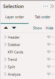
Layout: Guiding the Journey
- Balance aids in creating an intuitive layout, guiding users through the dashboard effortlessly. Properly aligned and proportioned elements help users find the information they need quickly, without feeling overwhelmed or confused.
- A well-structured layout also makes it easier for users to navigate the report and understand the relationships between different data points.
- To create a clean and organized layout, consider:
-
-
- Whitespace between elements and the borders of your canvas
- Using grids
-
- Alignment between the different elements in your report
- There are multiple ways of creating the layout most obvious is to just build on the fly within the Power BI platform itself.
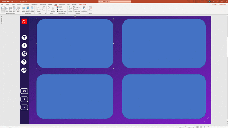
- Another way is to use PowerPoint. Yes, you read that right – PowerPoint. PowerPoint offers more shapes than Power BI, so you get more variety. Simply build a layout on a PowerPoint slide, save it as a picture, and use that as your bottom layer in Power BI.
Importance of Functionality
Data Visualization: Making Insights Shine
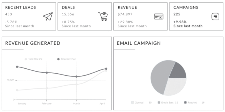
- Selecting the right visualization for your data is crucial for effectively communicating insights to your users. Each Power BI visual is like a building block, working together to build a strong data storytelling narrative. A well-designed visualization should not only be visually appealing but also help users quickly and easily understand the underlying data.

Interactivity: Engaging Users with Data
- Interactivity makes it easier to explore data, uncover insights, and control what information is shown on screen.
- Features such as tooltips, slicers, and drill-through capabilities can help users dig deeper into the data and customize their view to answer specific questions.
Performance: Optimizing for Speed and Efficiency
- A functional Power BI report should not only be visually appealing and easy to understand but also perform well.
- Slow-loading reports can frustrate users and hinder their ability to explore the data effectively. This can lead to users not adopting your reporting solution, which is not what you want.
Best Practices for Balanced Reports
- The Importance of Good Design: Good design ensures that your data not only looks professional but also communicates insights clearly, efficiently, and accurately.
- Clarity and Comprehension: Avoid cluttering your reports with unnecessary elements. Allow spaces between visuals, KPI’s that matter the most, and group the charts that are related together.
- Consistent Styling: Consistency in fonts, colors, and chart types enhances readability. Establish a style guide for you and your team to maintain uniformity across different dashboards.
2. Ensuring Maintainability: Ensuring maintainability means designing your Power BI solution so that it’s easy to update, troubleshoot, scale, and reuse—without breaking existing reports or requiring major rework.
- Modular Design: It is about structuring your reports, data models, and processes into separate logical layers or modules, each with a clear purpose. This makes debugging easy and can be utilized by the whole team/department.
- Document your data sources, add comments to your complex DAX measures, group your visual elements, and rename them correctly in selection panes. This makes life easier for others to understand and maintain the report.
- Achieving the Balance: Balancing good design with maintainability requires a thoughtful approach. Understanding your audience and the key insights they need. Highlight the insights by reducing unnecessary visual elements. Before using custom visuals, try to understand and use core visuals.
Challenges & Solutions for Balanced Reports
Complexity vs. Simplicity:
- Overly complex visuals may be visually appealing but difficult to interpret, while simple visuals might not capture the depth of the data.
- To address this challenge, prioritize clarity and legibility in your visualizations. Aim to communicate the most important insights with the simplest visuals possible and only add complexity when it truly enhances the user’s understanding of the data.
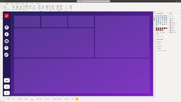
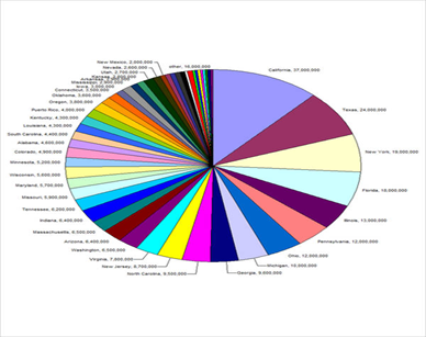
For eg, don’t create something like below:
Overloading Data:
- Don’t put a lot of information in a single report; this creates cluttered visuals and a confusing user experience.
- Break down complex topics into smaller, more digestible chunks, and use filters, slicers, bookmarks, or drill-throughs to allow users to explore the data at their own pace.
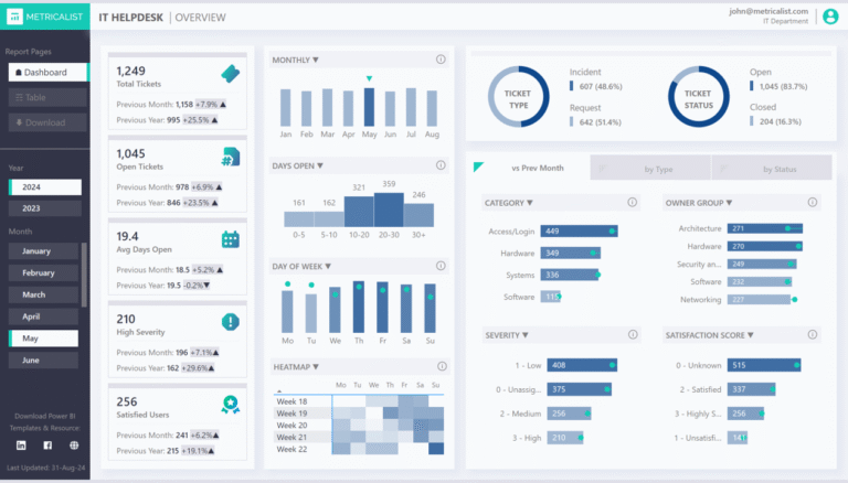
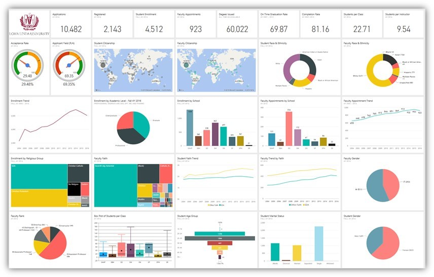
Don’t create reports like the one below:
Final Thoughts
In Power BI, great reports are not defined by how many visuals they contain or how advanced the DAX formulas are — they’re defined by how effectively they turn data into understanding and action. Achieving the balance between design and function means crafting reports that are not only beautiful and engaging but also accurate, performant, and meaningful.
By focusing on user needs, prioritizing data clarity, optimizing layout and navigation, using design elements purposefully, and continually refining your skills, you can create reports that not only capture the attention of your audience but also provide the valuable insights they need to drive data-driven decision-making.