In a world driven by data, organizations require more than static reports — they need real-time, intelligent visual analytics that guide decisions dynamically. Databricks AI/BI (Artificial Intelligence for Business Intelligence) Dashboards redefine this potential by combining AI-driven insights, intuitive interactivity, and scalable architecture on a single platform.
AI/BI dashboards unify data modeling, visualization, and AI assistance, enabling both technical and business users to create and consume insights seamlessly within Databricks.
Problem Statement:
Traditionally, creating business intelligence (BI) dashboards involved multiple tools — one for data transformation, another for modeling, and yet another for presentation. This approach leads to:
- Fragmented data governance and duplicated logic across reports.
- Time delays and dependency on technical teams for updates.
- Lack of interactivity and predictive intelligence in static dashboards.
- Inconsistent aggregation logic and metrics across departments.
Enter Databricks AI/BI, which solves these inefficiencies by integrating data engineering, analytics, and visualization in one governed environment powered by Unity Catalog and AI automation.
The Challenge of Integrated Game Analytics:
A rapidly growing interactive gaming company faced significant challenges in delivering real-time insights from disparate data sources: player telemetry, in-app transactions, device metrics, and marketing campaigns. Traditional BI tools involved complex data transfers and lagging refresh cycles. The need for a singular, scalable platform to quickly generate trusted dashboards was paramount. Databricks Dashboards emerged as the solution to:
- Deliver synchronized analytics within the same environment where data is processed.
- Enable real-time tracking of player engagement and revenue KPIs.
- Foster collaborative decision-making among analysts, developers, and marketing teams.
Implementation with Practical Examples / Use Cases:
AI/BI dashboards follow a simple, yet powerful workflow built directly into Databricks SQL environments.
Step 1: Create a Dashboard
From the Databricks workspace, select Dashboard →create dashboard. Choose a SQL Warehouse to execute backend queries.
Each dashboard supports multiple pages, datasets, and an interactive canvas for visualization placement.
Step 2: Define Datasets
Datasets can come from:
- SQL queries (SELECT * FROM workspace.default.gameplay_silver)
- Add datasource-Unity Catalog tables and metric views
- Uploaded CSV/Parquet files
For example, joining orders_raw and customers_raw creates a unified dataset for sales and customer segmentation analysis.
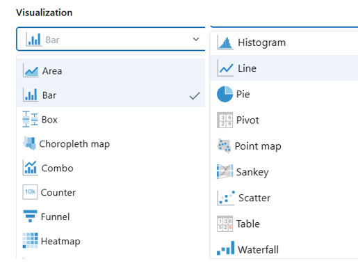
Step 3: Visualization Options: What’s Available?
Databricks offers an array of visualization types tailored to diverse analytic scenarios:
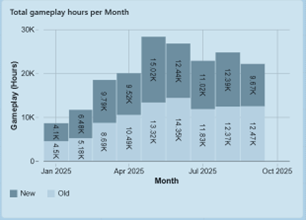
- Bar Charts: Compare categories like player sessions by country or in-game purchase counts on different platforms.
- Line Charts: Track player count growth or revenue trends over time, vital for monitoring campaign impact.
- Area Charts: Highlight cumulative metrics, such as total revenue across months.
- Pie Charts: Show distribution, e.g., percentage of players by game level or device type.
- Scatter Plots: Analyze correlations like session duration vs. purchase amount.
- Maps: Geographically visualize player distribution or server loads.
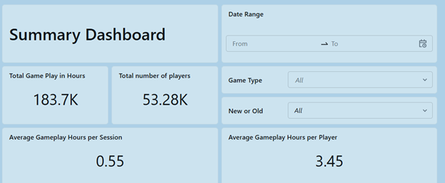
- Counters: Prominently display key figures like Daily Active Users (DAU) or Total Sales.
Each visual supports extensive customization: axis scaling, grouping, color palettes, and tooltips enrich user understanding and storytelling.
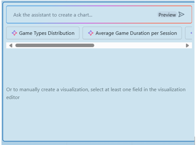
AI-Assisted Business Intelligence (AI/BI):
Databricks embeds AI capabilities through its AI Assistant that revolutionizes dashboard creation by translating natural language queries into SQL and generating appropriate visuals. This democratizes dashboard building by:
- Allowing non-technical stakeholders to create meaningful reports through simple prompts.
- Accelerating report development with automated query optimization and visualization suggestions.
- Leveraging historical usage and business semantics to recommend relevant measures and dimensions.
AI/BI helps teams bypass BI backlog bottlenecks, increasing agility and data accessibility for decision-makers.
Step 4: Metric Views: The Backbone of Consistency
Metric Views are curated, reusable datasets encapsulating business logic for measures and dimensions. They:
- Centralize KPIs like ARPU, player churn rate, or average session length as defined calculations.
- Enable multiple dashboards to share the same metric definitions, ensuring consistency company-wide.
- Simplify maintenance by isolating complex transformations—updates better propagate to all dependent dashboards.
- Support advanced functions like window functions for rolling averages or YOY comparisons.
Step 5: Deep Dive: Parameters and Filters in Dashboards
Interactivity is critical in dashboards for meaningful data exploration:
- Parameters: Dynamic placeholders within SQL. These allow dashboard users to input or select values (e.g., select a date range or game title), making reports reusable and flexible without changing query scripts themselves.
- Filters: Visual UI controls bound to parameters or fields, enabling users to slice and dice data in real time. Filter types include dropdowns, multi-select lists, date pickers, and search boxes.
Dashboard leverages parameters to let marketing analysts quickly filter performance by campaign or region and dynamically adjust the date window to spot emerging trends.
Both parameters and filters execute server-side, ensuring efficient querying even with very large datasets.
Step 6: User Interface
Databricks allows users to customize the theme of dashboards to align with organizational branding and improve readability. Users can select from preset themes or create custom themes by adjusting color palettes for fonts, backgrounds, widgets, and visualizations using color pickers or HEX/RGB codes. Dashboard settings also enable customization of font styles, widget appearance, and title alignment (left, center, or right). Additionally, themes can be previewed in both light and dark modes. These theme settings apply globally to all widgets and visualizations on the dashboard for a consistent user experience.

Step 7: Build Visualizations
Drag widgets onto the Canvas Tab to create charts such as:
- Counters for KPIs (Total Orders, Total Sales)
- Bar Charts for sales by year
- Pie Charts for order status distribution
- Scatterplots for relationship analysis
- Line Charts with AI Forecasting for trend projections
Every visual can be configured using a property panel, defining axes, transformations, aggregation types, and format conventions (currency, percentages, etc.).
Example – KPI Counter Widget
sql
select count(distinct user_id) as total_players from workspace. default.gameplay_silver,
Displays the total number of players as a summarized KPI.
Step 8: Apply Custom Calculations
Users can define custom on-dashboard metrics by adding Custom Calculation Fields within the “Data” tab.
Example: Total Tax Metric
sql
SUM(total_price) * 0.10 AS total_tax
This creates a dynamic field “Total Tax” that behaves as a native measure throughout all visualizations.
Step 9: Configure Alerts
Set alerts on SQL queries driving your visualizations — e.g., notify when daily orders drop below a threshold or when revenue exceeds targets. Alerts integrate via email or webhooks, enabling proactive monitoring.
Step 10: Forecasting and AI Visual Generation
The AI Forecast (Beta) feature can project trends automatically using the AI_FORECAST() Databricks SQL function. Meanwhile, an AI prompt such as “Show total orders by year” lets Databricks Assistant generate complete visualizations intelligently.
Step 11: Publishing and Sharing
Once complete, click Publish to share dashboards with controlled access:
- Embed Credentials (view as owner)
- No Embedded Credentials (user-based permissions)
Users can also embed dashboards into web apps using iframe embedding or schedule automatic refreshes for live data delivery.
Key Features / Benefits:
Feature | Description | Benefit |
AI-Powered Authoring | Natural language queries and auto-chart generation | Reduces the technical barrier for non-technical users |
Cross-Filtering & Drill through | Clickable visuals filter others dynamically | Enables deep interactive exploration |
Custom Calculations | Add inline metrics like taxes or margins | No need for backend engineering changes |
Metric Views Integration | Reusable semantic models | Consistency across teams and dashboards |
AI Forecasting | Predictive analytics integrated in visualizations | Forecast sales, revenue, or trends |
Widgets & Parameters | Interactive filters and text inputs | Personalized user exploration |
Embedded Dashboards | Share dashboards on intranet portals | Wider audience visibility |
Alerts & Schedules | Automated notifications and data refreshes | Real-time monitoring |
Genie AI Integration | Conversational analytics in dashboards | Natural query experience for consumers |
Pre-Requisites:
Before creating Databricks AI/BI Dashboards, ensure the following:
- Databricks SQL Access Entitlement (active SQL Warehouse).
- Unity Catalog for governance and sharing.
- Dataset Access Permissions with at least “Can Use” rights.
- Databricks Workspace Connection to a supported cluster.
- Basic understanding of SQL queries and visualization principles.
Optional but recommended:
- Enable Serverless SQL Warehouse for faster performance.
- Define Metric Views centrally for enterprise-wide semantic consistency.
Conclusion:
Databricks AI/BI Dashboards provide a comprehensive and unified analytics platform that bridges the gap between raw data and intelligent decisions. By integrating data, visualization, and AI-native capabilities, teams can:
- Rapidly build dashboards without complex ETL steps.
- Explore data interactively using cross-filtering and drill-throughs.
- Integrate predictive and conversational analytics seamlessly.
These dashboards empower business users with autonomy while maintaining robust data lineage and governance for technical teams — a true convergence of scalability and intelligence.
Limitations:
While AI/BI dashboards are feature-rich, some limitations remain:
- Beta features (like AI Forecast) may produce variable accuracy.
- Limited custom HTML/CSS editing, restricting advanced UI customization.
- Interactivity performance can degrade with very large datasets.
- Cross-workspace dashboard embedding may require admin-level configuration.
- Drill-through navigation currently supports only dashboards within the same workspace.
- No native export to Power BI/Tableau (requires APIs or connectors).
- Restricted script execution — complex Python/R/ visual logic must occur outside dashboards.
Despite these constraints, Databricks continually evolves its AI/BI platform. The roadmap includes enhanced performance tuning, visualization libraries, and deeper integration with Lakehouse AI.